In today’s digital age, it’s easier than ever to connect with people across the world, but it also means our digital tools need to be more inclusive to help us connect. One aspect of inclusivity, often forgotten, is typography. It is of great benefit when typefaces are clear, readable, and consistent. In many cases, typeface consistency is often lost during the localization process due to the lack of multilingual font variations. In 2013, Google commissioned the font Noto and released it as “the typeface for the world”.
What is Noto?
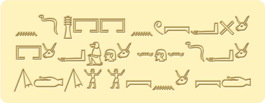
Noto is a free open-source collection of high-quality Google fonts. The typeface supports more than 1,000 languages and over 150 writing systems, even ancient Egyptian hieroglyphics.
Noto facts
- Noto is the name of the typeface, a collection of 211 font families with over 77,000 characters. (50+% of the 149,186 characters defined in Unicode 15.0)
- Noto Sans is a variable sans serif font family (1 of the 211) available in 852 languages across 236 regions.
- Noto Sans Mono is a monospaced, unmodulated (“sans serif”) design suitable for programming code and other uses where a fixed-width font is needed.
- Noto Music, enables you to type in musical notation with its 579 glyphs.
- Noto includes 2 emoji font families. Noto Color Emoji and Noto Emoji.
- In Latin, ‘Noto’ translates to ‘I write, I mark, I note’.
What is the difference between ‘font’ and ‘typeface’?
Commonly, both ‘font’ and ’typeface’ are misunderstood to mean the same thing, even among design professionals. However, both words mean different aspects of the same thing.
Typeface: Is the overarching name for the collection of characters that all have the same style. Some famous typefaces are: Times New Roman, Arial, and Helvetica.
Font: The individual style of the characters; for example, Noto Sans Bold, Noto Sans SemiBold, and Noto Sans Italic are all separate fonts, but live under the Noto Sans typeface.
Why was Noto developed?
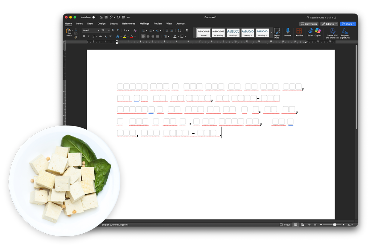
The name Noto originates from Tofu, and is shortened to mean ‘No Tofu’. To understand why ‘No Tofu’ is so significant in computing, we first must consider how tofu is traditionally served… Simply, in small square pieces.
So how does this relate to computers and fonts? Whenever a font problem occurs, it is common for systems to display a blank square to indicate a missing character. For many years, users would refer to those boxes as ‘Tofu’. One of Google’s goals when designing this new typeface was to ensure that the font would support every language and every character, and ensure there was ‘No Tofu’ for all users. Thus, they called their new typeface Noto.
 The release of Noto solved two challenges Google had identified:
- Google’s mission statement has always been, and forever will be, to ensure all knowledge is universally accessible and helpful to people. Noto enables the majority of users to access knowledge no matter their preferred written language.
- The release of the Google Chromebook in 2011 spearheaded the need for a consistent universal font that would work on all these new devices.
How has Noto impacted our digital landscape?
Google partnered with Monotype, a font engineering company, to help them meet all the crucial requirements for a font. While writing their proposal, Montotype studied a diverse array of typefaces to show reference for what they believed the font should incorporate. After researching a collection of lesser-used and dead languages, they realised the importance of preserving them digitally.

As you can imagine, creating a typeface for multiple languages is no easy task. When creating a new script, Monotype spent time researching and collecting all available versions of the language and script. The second stage is looking at style, which is basically them diving in and immersing themselves in the culture and trying to produce something that is acceptable and doesn’t unintentionally alienate a group of people.
The research and development of Noto far exceeded the typical processes and outcomes when creating new fonts. The typeface was designed to develop Unicode standards for all of the languages it supports. Something many language communities could not afford to do on their own.
Adobe version of Noto: Source Han
In the run up to its release in 2014, Google collaborated with Adobe to help expand the Noto project with ‘Source Han Sans‘. A pan-Asian Chinese, Japanese, and Korean (CJK) typeface that supports CJK, as well as Latin, Greek and Cyrillic characters from the Source Sans family.
Does Noto help with accessibility?
Strong readability: When designing Noto, the goal wasn’t just eliminating Tofu, it was also making sure that all language characters were readable to everyone. All 77,000+ characters are designed with variation to support multiple low-vision accessibility challenges.
Each character is distinct: A common issue with latin characters is that the number ‘1’, a capital ‘i’, and a lowercase ‘L’ are commonly confused as they look similar. (1il) Noto has made sure that each character is distinct from the others to improve comprehension across all of its supported languages.
It’s open source: Noto is free and widely available for designers and developers for all of their digital projects. Because of its open source nature, there is a constant opportunity to share feedback and be a part of its development to benefit the project for everyone. Contribute to the Noto typeface here.
Where can you download Noto?
Noto is a free, open-source Google font. All Noto fonts are licensed under the Open Font License (OFL). “You can use OFL’s in books, posters, artwork, logos, and on websites, even make 3D objects with the outlines with no acknowledgement required.” Here’s how Google suggests you download the Noto fonts you need:
To use Noto fonts on your computer (a notebook or desktop), you should download the font families you’re interested in and install them.
- Click the Fonts tab to go to the Noto font selector, which shows samples of all fonts from the Noto font collection.
- In the search box, type the name of the style (like Serif) or script (like Devanagari) or language (like Russian) or region (like India), or click the region or language dropdown to filter the collection.
- Use the font size dropdown or slider to make the samples smaller or bigger. Use the rightmost buttons to see the samples as tiles or as a list.
- Click a sample to go to the specimen page for the selected font family.
- Click Download Family to download the selected Noto font family as a.zip archive.
- Continue the above steps for each Noto family that interests you.
Src: https://fonts.google.com/noto/use
Should I use Noto for all my multilingual projects?
On the one hand, Noto is a fantastic option for your next multilingual publication or localization project. There are no costs and there’s a high chance it will cover all of your language and character requirements. But of course, there are myriad factors that determine which direction is best for your needs. Such as: brand guidelines, software limitations, editorial requirements, and your creative director’s font insistence of the month.
Additionally, it’s important to remember the right font isn’t going to solve all your multilingual needs. As we mentioned at the start of this article, font consideration is often overlooked. Consider using a professional language service provider for your next multilingual project. Our knowledge depth and expertise can help you ensure all the boxes are checked, including the ones that weren’t obvious at first. Here’s a list of services where we believe consultation on fonts would benefit you: